Liquify Pro Elements
Introduction
Our provided tags (li-object, li-for, li-if etc.) offer the capability to construct nearly any desired Shopify logic. However, for more intricate components such as the Mini-Cart or Variant swatches, we've introduced li-element, li-js-object, li-js-price and li-js-if tags. These tags simplify the process, allowing you to create complex components more easily. They harness real-time data from Shopify APIs, enabling seamless data updates without requiring the site to reload. This significantly enhances the overall e-commerce experience. In the following steps, we furnish the initial Liquify building blocks to craft exceptional e-commerce experiences.
Alpine JS
Alpine is a robust, minimal tool designed for crafting behavior directly within your markup, serving as a modern equivalent to jQuery. Simply insert a script tag (Already inside the starter Template), and you're ready to begin. We leverage Alpine JS to offer you the foundational elements for creating AJAX behavior within your cart or variant selector.
Moreover, Alpine JS extends its assistance to other JavaScript functionalities as well. To explore the full range of features that Alpine JS offers, we recommend referring to the documentation and installing the Alpine JS Chrome extension. This extension allows you to inspect the data provided by the Shopify API and its associated objects, facilitating a comprehensive understanding of their structure and content.
li-object vs li-js-object
Both tags work similarly by displaying information from the Shopify CMS. The regular li-object is used for Liquify functionality, while the li-js-object accesses Shopify's API responses via Alpine JS. We currently use the li-js-object in various components and plan to implement more in the future. Here is an example on how the two tags get converted:
This will be converted into:
And this is an example for li-js-object:
This will be converted into:
li-js-price
As we can't apply Liquify filters in our Alpine JS Data, we have to come up with alternative methods. This special object Tag will display a number in the store's currency.
Coming Soon: You can also use the same position modifier like :class, :name, :src etc. For more information, please check out the li-object documentation.
li-js-if
If you want to hide things based on certain rules, you can use li-js-if with Shopify's Date API. For example, the original price when a discount is applied.
This will be converted into:
li-element
Sometimes, we use the li-element in Webflow for special purposes to make things easier. We've established predefined functionalities for these tags, with plans for further expansion in the future. For instance, the "Add-to-cart" element is given a special tag called li-element="add-to-cart". In the next sections, we'll explain how these are commonly used.
Mini Cart
The Mini-Cart is a widely used component in the E-Commerce realm. It pops up when a product is added to the cart and usually slides in from the right side. We avoid using the Webflow-Ecommerce Elements in Webflow due to its excessive and unnecessary JavaScript load we don't need in Shopify. Instead, in Our Starter Theme, you'll discover a header containing all the necessary elements. The is-open class triggers the element to open. You can style the transition the way you want.
Before we explore the component further, here are some versatile elements that can be used throughout your entire Webflow project:
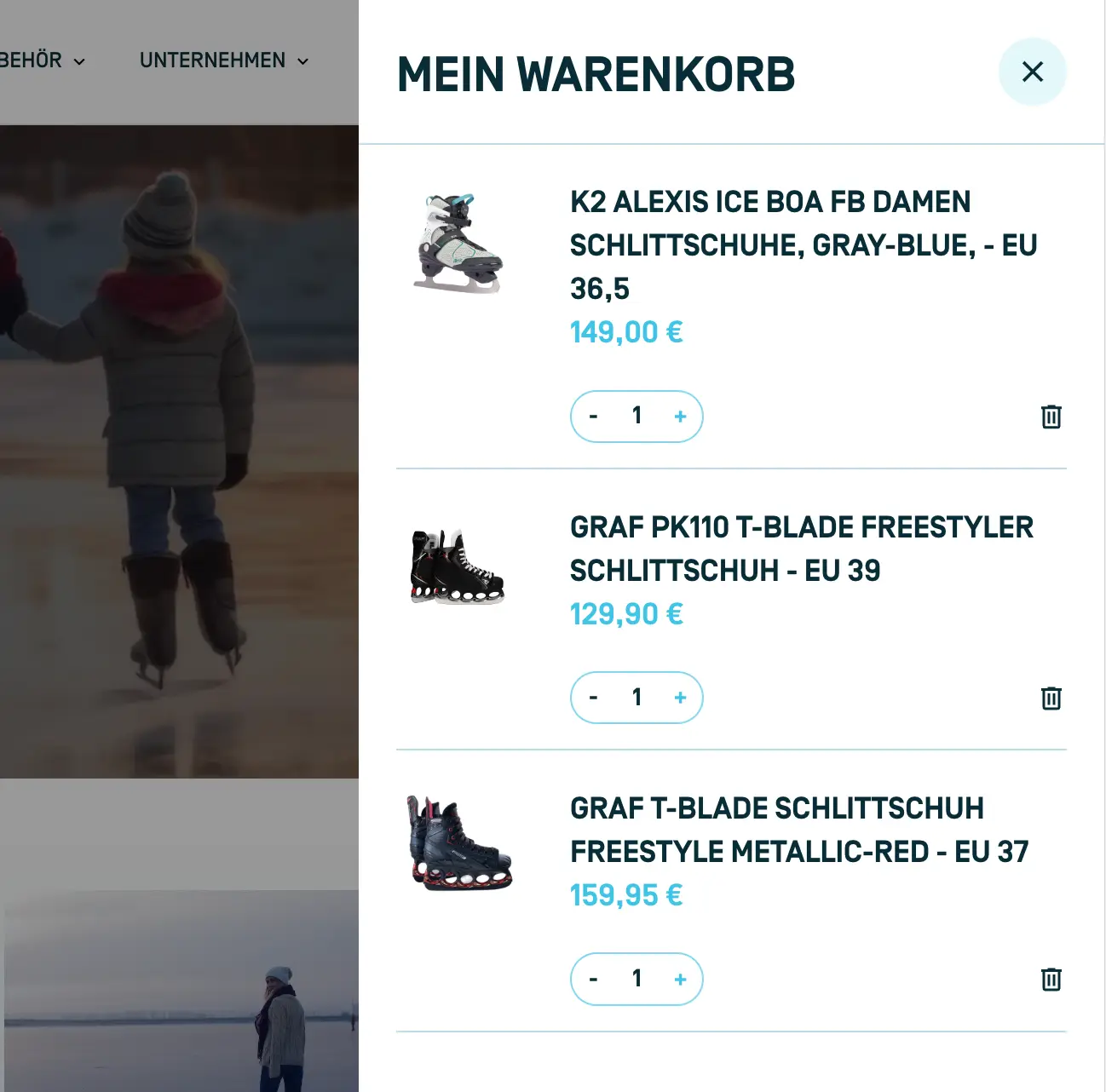
Add-to-Cart
Place this element within a product item. It adds the current variant to the cart and triggers the Mini-Cart to open upon clicking.
Mini-Cart Toggle
This element toggles the mini-cart's visibility upon clicking and can be positioned anywhere within the theme. Typically, it's used as a cart icon in the navbar for easy access.
Mini-Cart Item Count
This element displays the current number of items in the cart and can be positioned anywhere within the theme. It's commonly used to show the item count in the navbar.
Mini-Cart Empty
This element is displayed when the mini-cart is empty and can be placed anywhere within the theme.
Mini-Cart Component
Discover all the essential elements required for and usable within the mini cart here. The grey outlines show how the elements should be nested within one another.
mini-cart: This element holds and shows the component. Every following element should go inside this one.
mini-cart-container: This element is the actual Mini-Cart and appears animated when the is-open class is applied. You can only position this element once on a page. It needs to be inside the mini-cart
Within this element, use the li-js-object to showcase the cart information. Here's an example of the objects available for use:
- total.price
- total.discount
- total.original_total_price
mini-cart-full: This element should be placed within the mini-cart-container element and will be shown when the cart has items inside. It needs to be inside the mini-cart-container
mini-cart-item: This element should be placed within the mini-cart-full element and represents an individual item within the Cart. It needs to be inside the mini-cart-full
Within this element, use the li-js-object to showcase product information. Here's an example of available objects for use:
- product.title
- product.featured_image
- product.vendor
- product.price (name: li-js-price)
mini-cart-item-increase: This element should be nested inside the mini-cart-item and can be added to a div to increment the product quantity in the cart. Change the Cursor to pointer for a better usability. It needs to be inside the mini-cart-item
mini-cart-item-decrease: This element should be nested inside the mini-cart-item and can be added to a div to decrease the product quantity in the cart. Change the Cursor to pointer for a better usability. It needs to be inside the mini-cart-item
mini-cart-item-remove: This element should be nested inside the mini-cart-item and can be added to a div to remove the product from the cart. Change the Cursor to pointer for a better usability. It needs to be inside the mini-cart-item
mini-cart-item-quantity: This element should be placed within the mini-cart-item and connected to a div. The div will be replaced by an input field, allowing the customer to adjust the quantity of the item. It needs to be inside the mini-cart-item
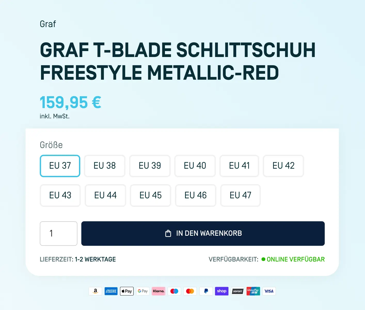
Product Variant Swatch
We've developed a specialized component for both the Product Page and Product Item to enhance usability. The Product Variant Component enables you to generate a variant swatch, allowing variant selection without page reloading. It shows you what variant you're looking at and lets you change details when you choose a different one. Below, you'll find all the elements you can use.
Product Variant Component (Radio Buttons)
Here you can find all the Elements which are needed and can be used inside the Product Variant Component. The grey outlines show how the elements should be nested within one another.
product-variant-container: This Element wraps and renders the component. All the following Element need to be inside this Element.
add-to-cart: This element enables the "add-to-cart" function. Whenever someone clicks on it, the currently selected variant will be added to the cart. It needs to be inside the product-variant-container
checkout-add-to-cart: This element enables the "add-to-cart" function but redirects the customer directly to the Shopify Checkout. You can choose between using either add-to-cart or checkout-add-to-cart, depending on your preferred action. It needs to be inside the product-variant-container
add-to-cart-quantity: This Attribute should be added to an input field. It allows your customers to adjust the quantity before adding the variant to the cart. It needs to be inside the product-variant-container
product-options-loop: This Element generates a list containing all the options created for that specific product (e.g., Size, Color, etc.). It needs to be inside the product-variant-container
product-options-name: This Element shows the name of the option, such as "Color." It needs to be inside the product-options-loop
product-option-loop: This element generates a list of all option values inside the option (e.g., Red, Green, etc.). It needs to be inside the product-options-loop
product-option-input: This Element represents a single option value, for example, "red," "blue," etc. When the Option Value is not available, the class is-not-available will be added. It needs to be inside the product-option-loop
product-option-name: This Element needs to bin inside the product-option-input and displays the name of the current option value ("red", "blue" etc.). It needs to be inside the product-option-input
direct-add-to-cart: You can use this attribute without a product-variant-container if you don’t want to give users the option to select a variant. In this case, the first available variant will automatically be added to the cart.
Product Variant Component (Select Fields)
Here you can find all the Elements which are needed and can be used inside the Product Variant Component. The grey outlines show how the elements should be nested within one another.
product-variant-container: This Element wraps and renders the component. All the following Element need to be inside this Element.
add-to-cart: This element enables the "add-to-cart" function. Whenever someone clicks on it, the currently selected variant will be added to the cart. It needs to be inside the product-variant-container
checkout-add-to-cart: This element enables the "add-to-cart" function but redirects the customer directly to the Shopify Checkout. You can choose between using either add-to-cart or checkout-add-to-cart, depending on your preferred action. It needs to be inside the product-variant-container
add-to-cart-quantity: This Attribute should be added to an input field. It allows your customers to adjust the quantity before adding the variant to the cart. It needs to be inside the product-variant-container
product-options-loop: This Element generates a list containing all the options created for that specific product (e.g., Size, Color, etc.). It needs to be inside the product-variant-container
product-options-name: This Element shows the name of the option, such as "Color." It needs to be inside the product-options-loop
product-option-select: This attribute should be applied to a select element. We recommend using a Webflow custom element, as you’ll also need to add an attribute to the options within the select element. It needs to be inside the product-options-loop
product-option-select-loop: This Element represents a single option value, for example, "red," "blue," etc. This attribute needs to be placed on a option element inside the product-option-select. We recommend using a Webflow custom element for this.
direct-add-to-cart: You can use this attribute without a product-variant-container if you don’t want to give users the option to select a variant. In this case, the first available variant will automatically be added to the cart.
Bundle Element
With the Liquify Pro Bundle element, you can easily create bundle features in your Shopify store. You have full control over the design and functionality, and you can use the element anywhere.
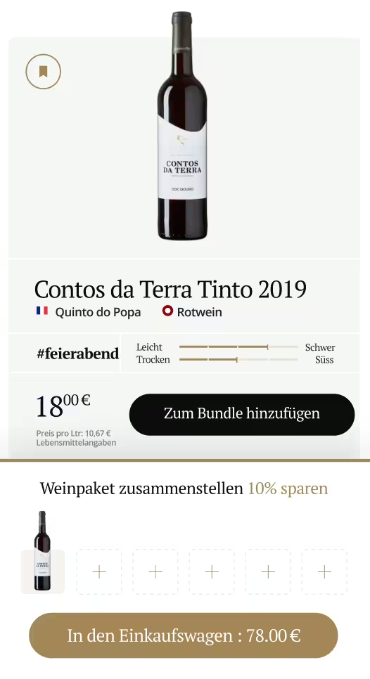
Bundle Container
The key part to understand is that the li-element="bundle-container" opens an Alpine.js store where you can add individual products by clicking on li-element="add-to-bundle". Then, li-element="add-bundle-to-cart" adds all the products in the bundle to the cart, making it very flexible for your store’s needs.
bundle-container: This Element wraps and renders the component. All the following Elements need to be inside this Element.
bundle-add-to-bundle: This element enables the "add-to-bundle" function. Whenever someone clicks on it, the currently selected variant will be added to the bundle. It needs to be inside the product-variant-container or the product form.
bundle-add-to-cart: Add this attribute to a button or div to allow customers to add all products they’ve included in the bundle with bundle-add-to-bundle directly to their cart. It needs to be inside the product-variant-container
bundle-item: This element generates a list of all products added to the bundle store via bundle-add-to-bundle. Within each bundle-item, you have access to both the variant and product objects for each item. It needs to be inside the product-variant-container
bundle-quantity: Place this attribute on an input or text field, so the user can adjust the quantity of a bundle item. It needs to be inside the bundle-item
bundle-quantity-increase: Add this attribute to a div to let users increase the item quantity by clicking on it. It needs to be inside the bundle-item
bundle-quantity-decrease: Add this attribute to a div to let users decrease the item quantity by clicking on it. It needs to be inside the bundle-item
li-js-object: Now you can use li-js-object to access all item information, such as product or variant details. For example, retrieve the product title with:
Convert Your Theme
Learn how to convert your Webflow project into a Shopify Theme using Liquify.